Pride is not a decorative moment. It is a powerful act of being
seen, heard and valued.
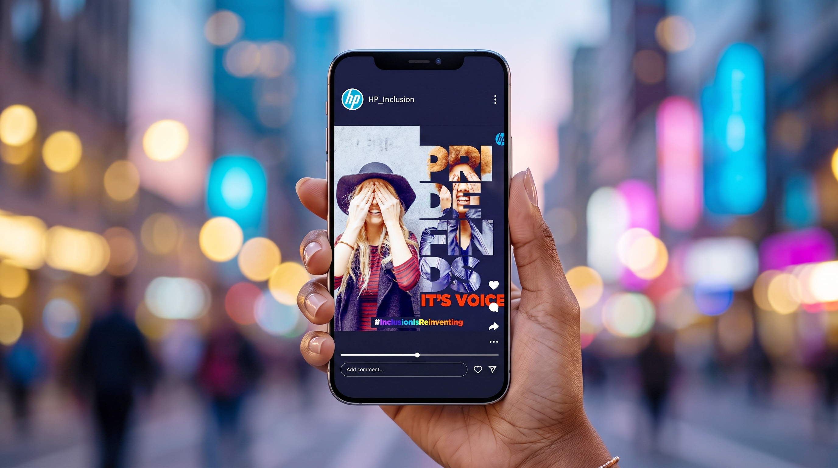
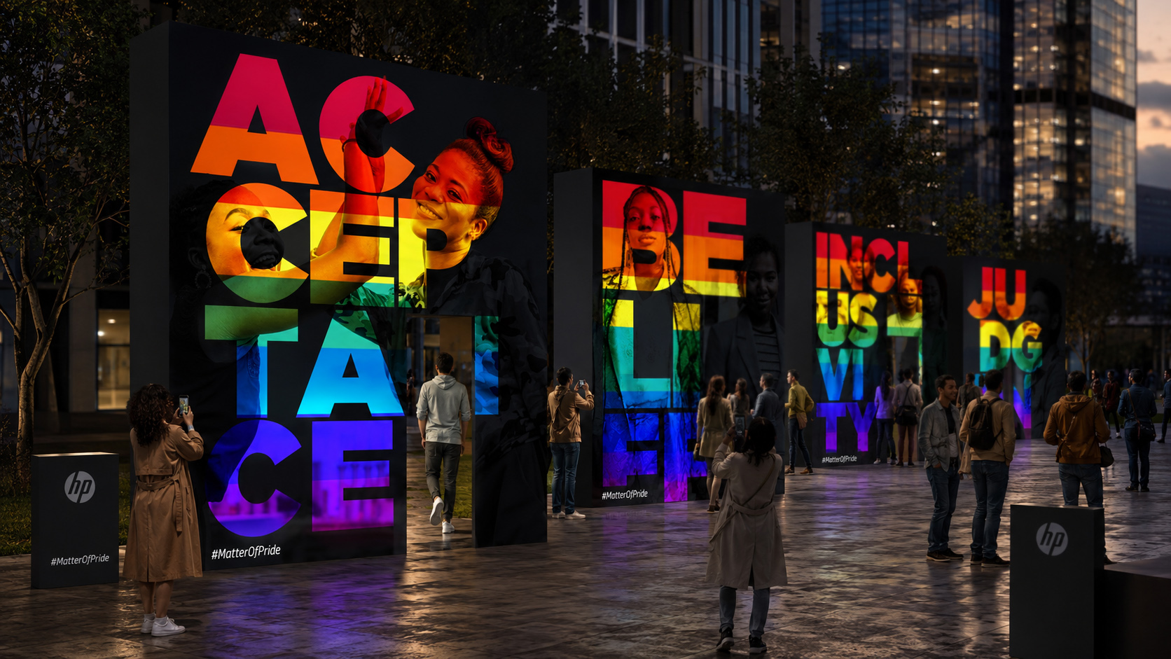
Created for HP’s Pride Month communication, this campaign
transforms typography into a living expression of inclusion.
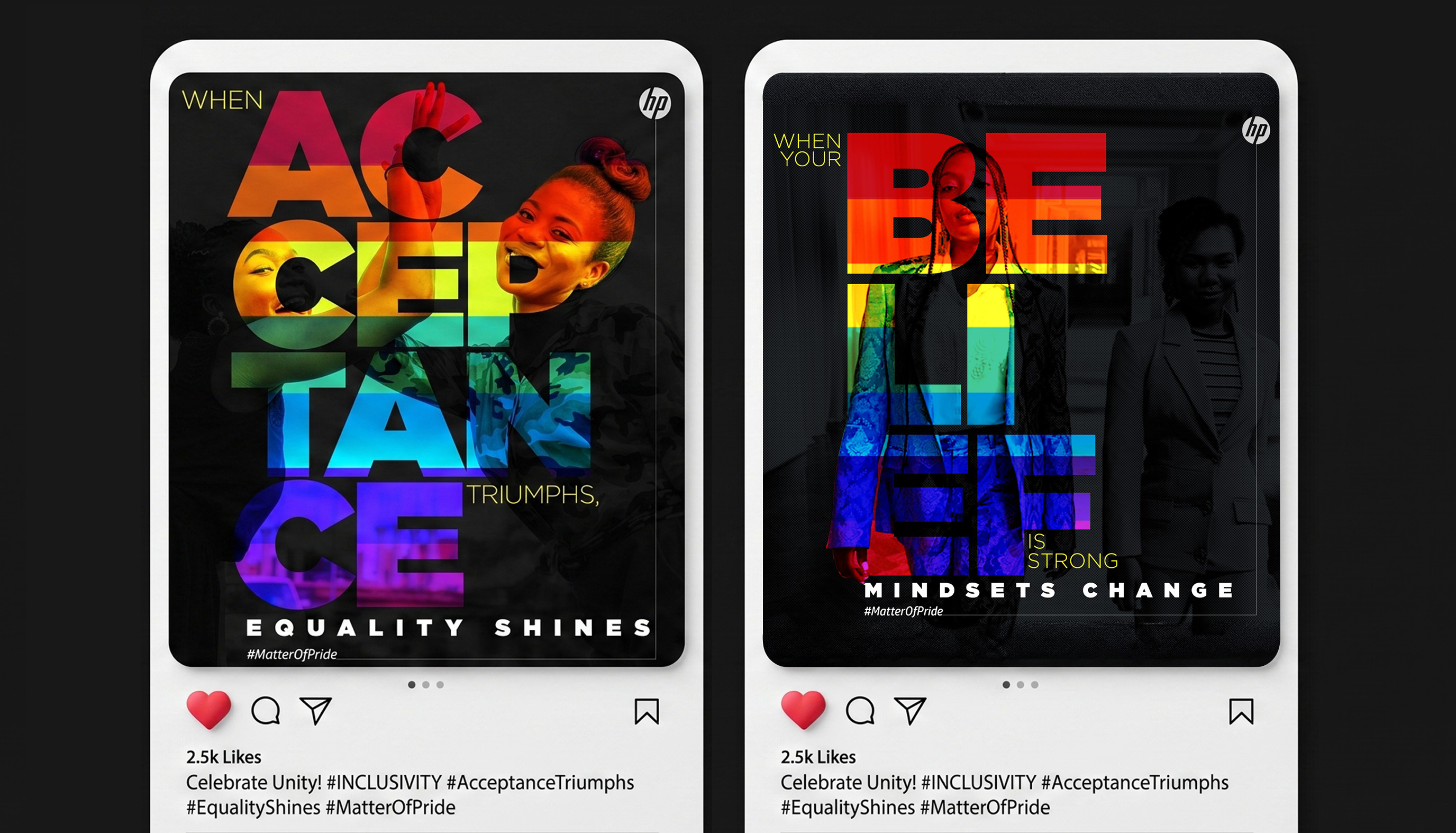
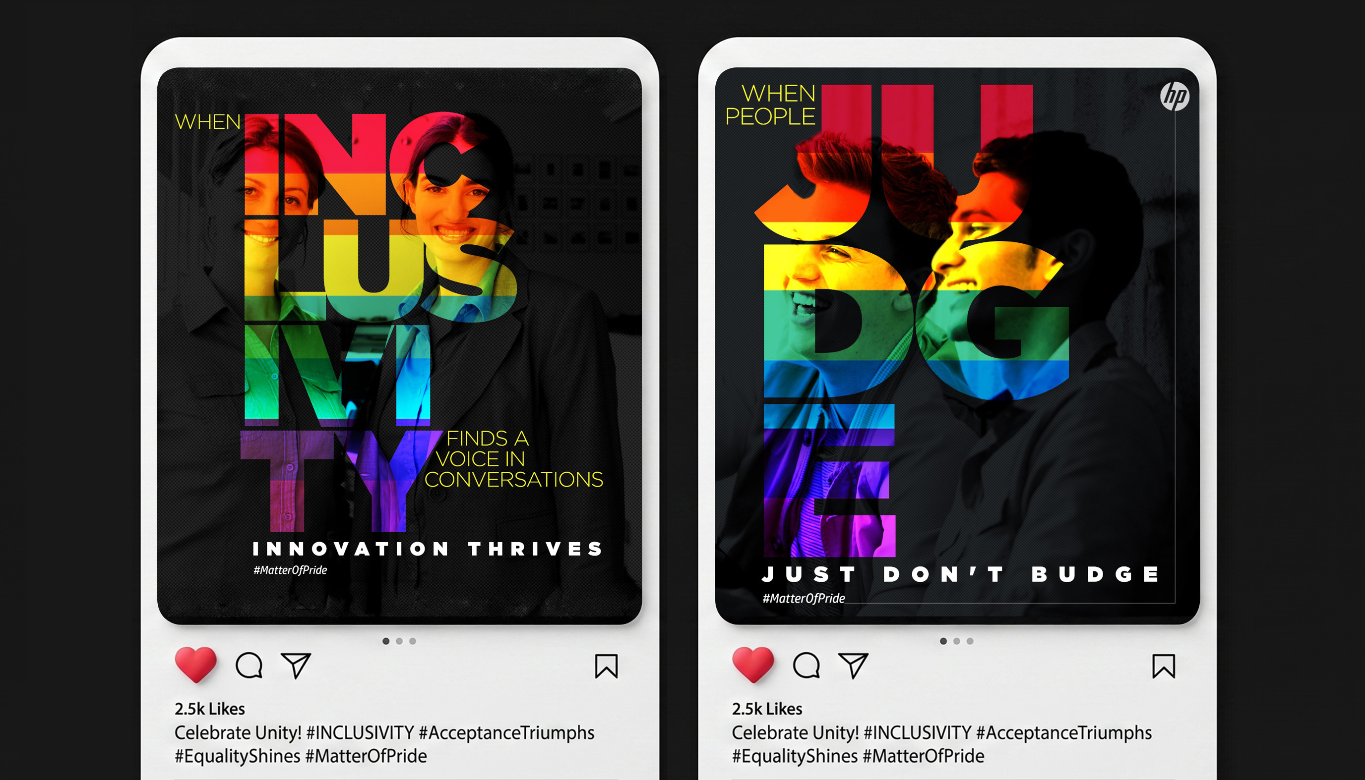
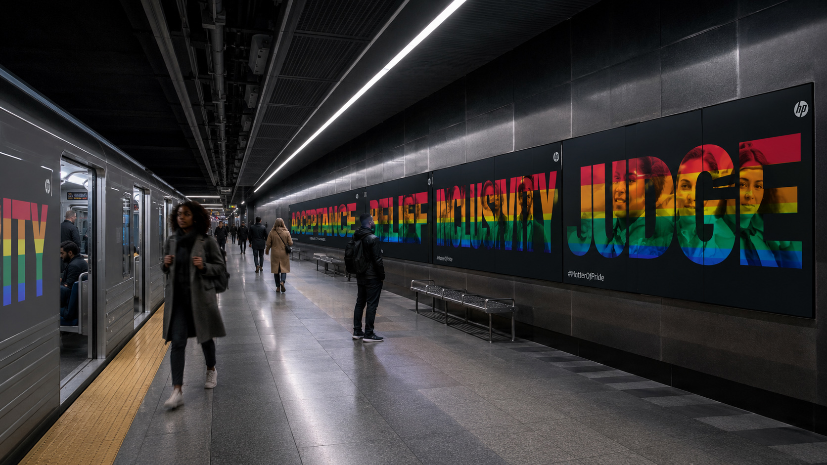
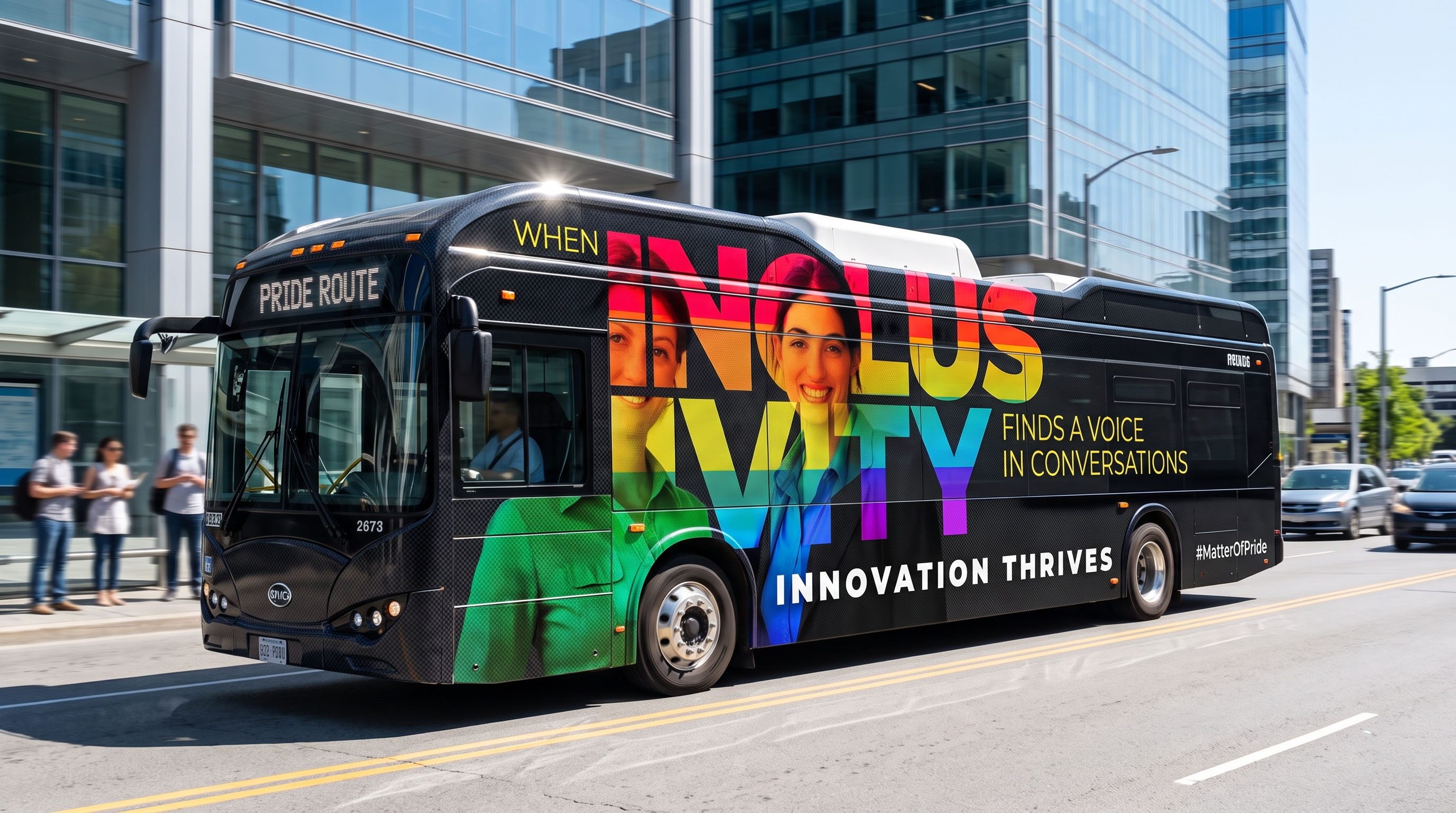
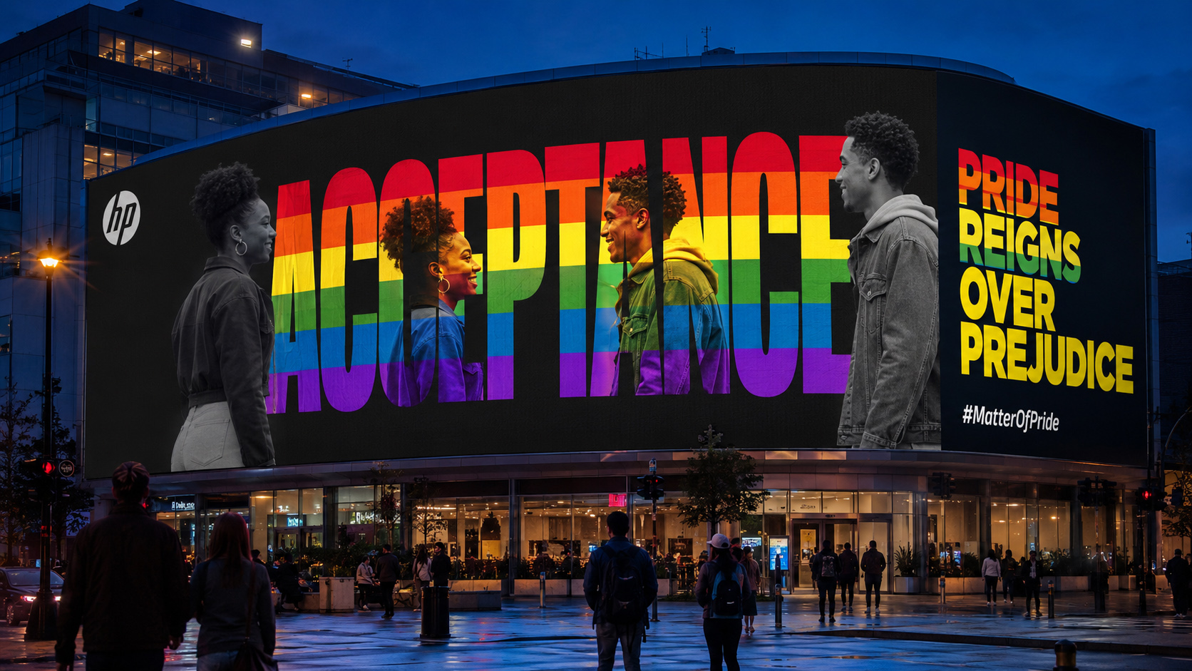
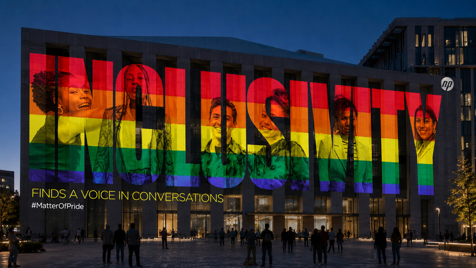
Words such as ACCEPTANCE, BELIEF, INCLUSIVITY and JUDGE become
more than statements: they become visual windows into real
people, individual identities and shared human experiences.
Black-and-white photography establishes honesty and emotional
depth, while the signature colours of Pride move through the
letterforms with energy, optimism and unmistakable visibility.
Across its two creative routes, the campaign shifts seamlessly
between reflection and declaration. One allows equality to
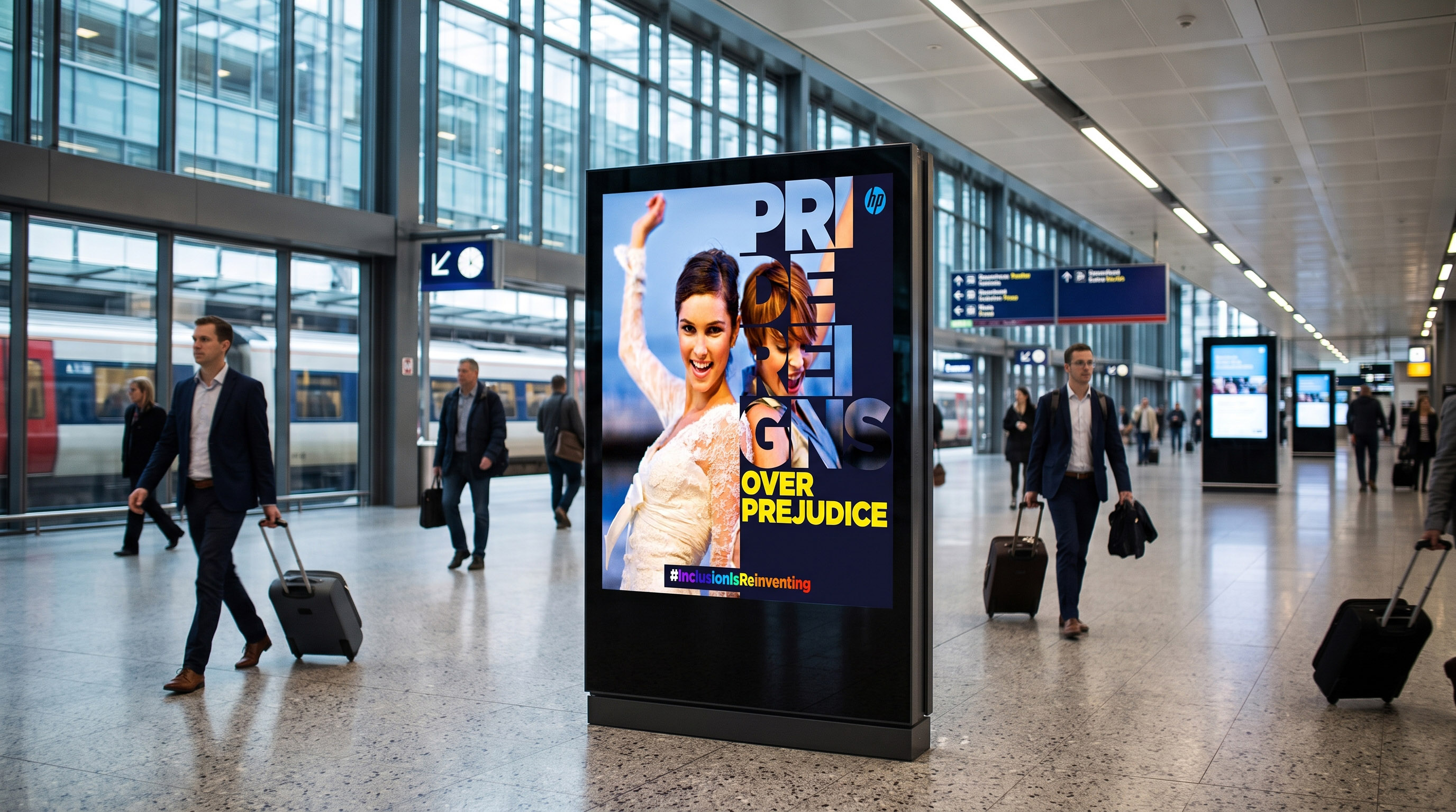
emerge through layered portraits and language; the other gives
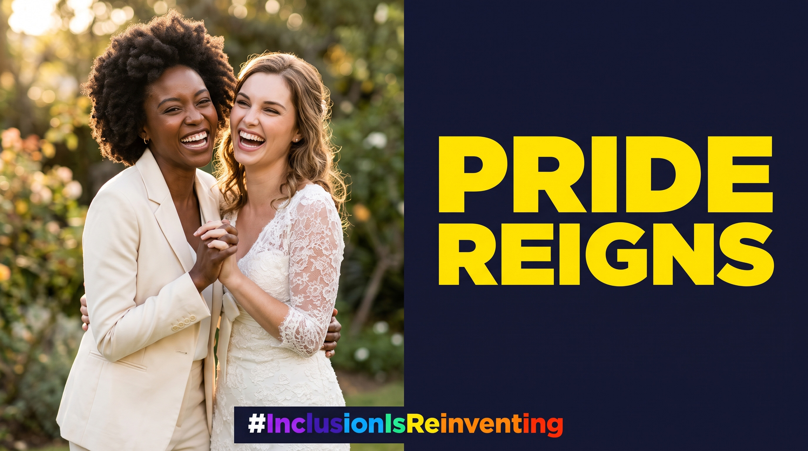
PRIDE an unapologetically commanding voice—one that finds
expression, challenges prejudice and occupies space with
confidence.
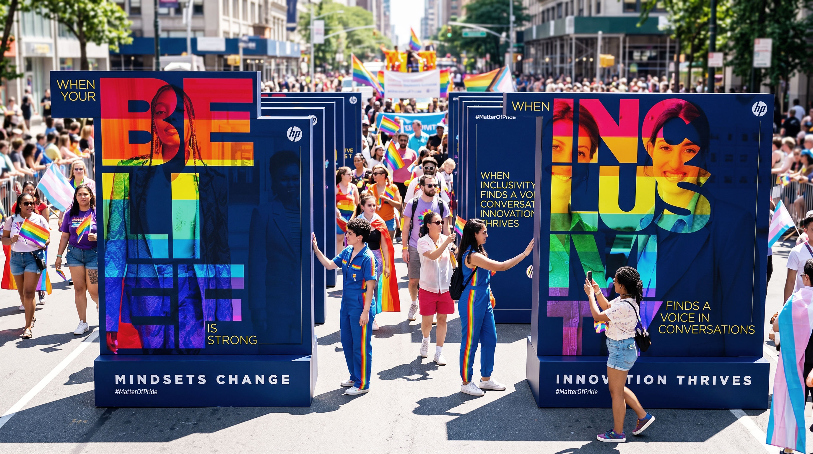
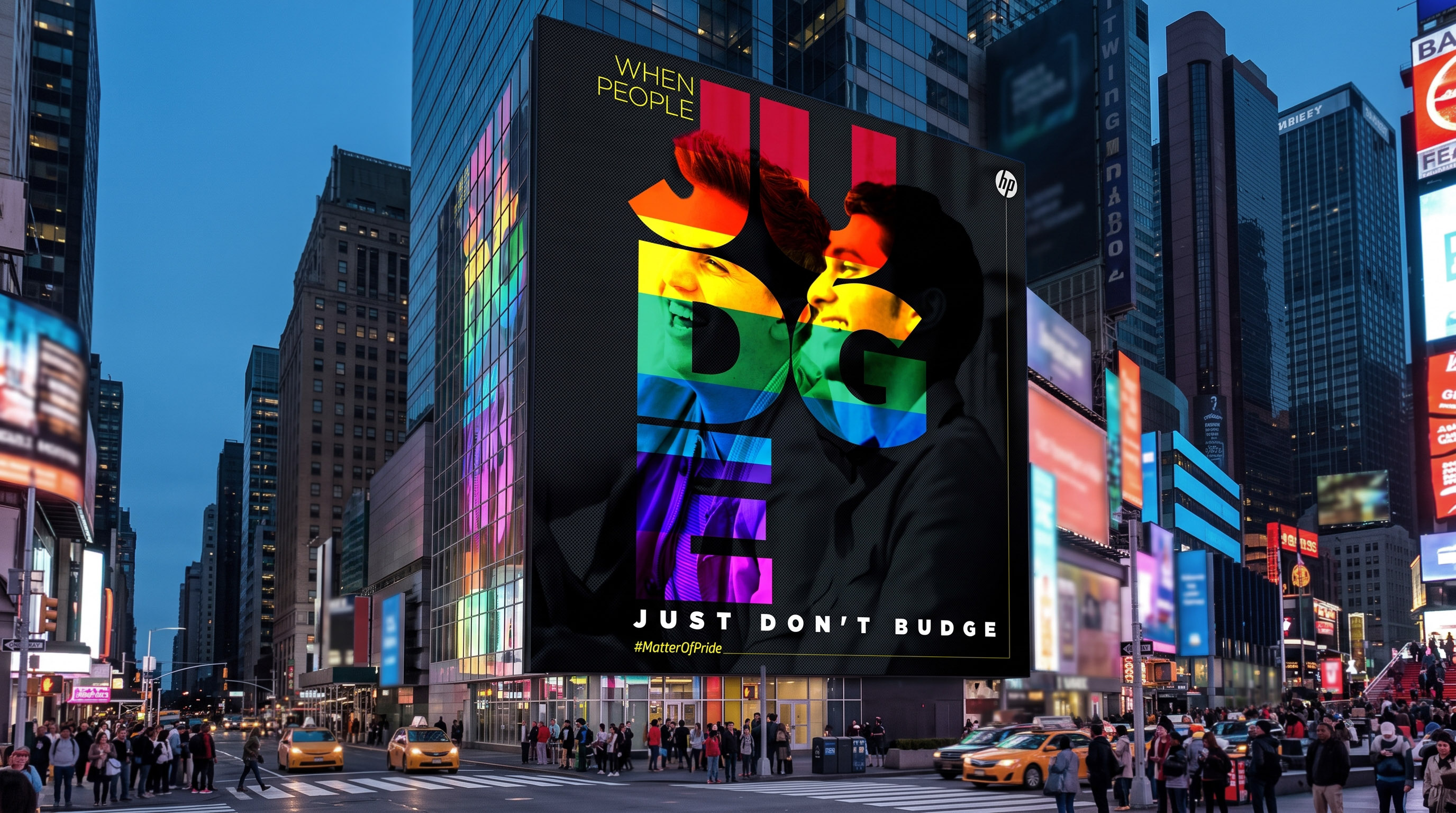
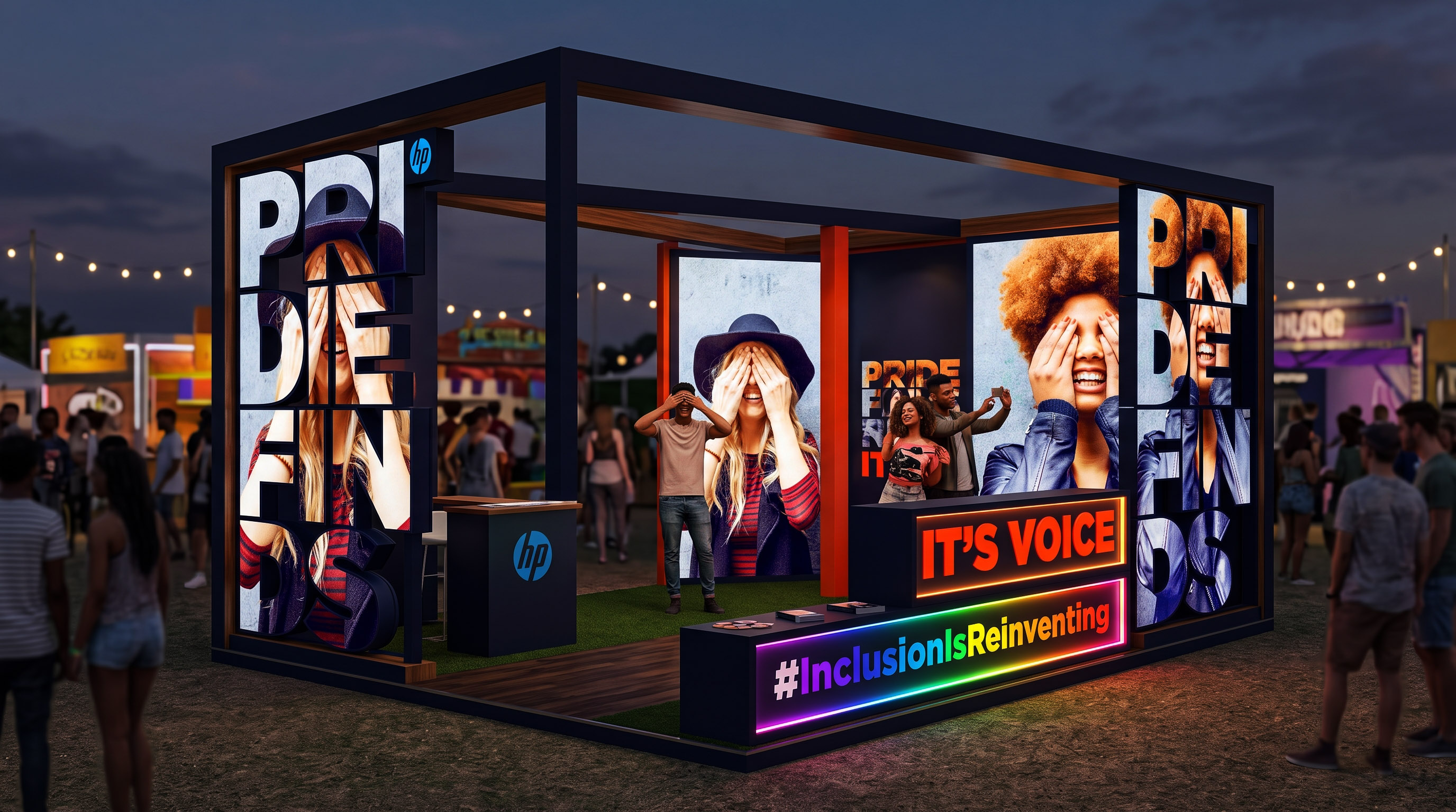
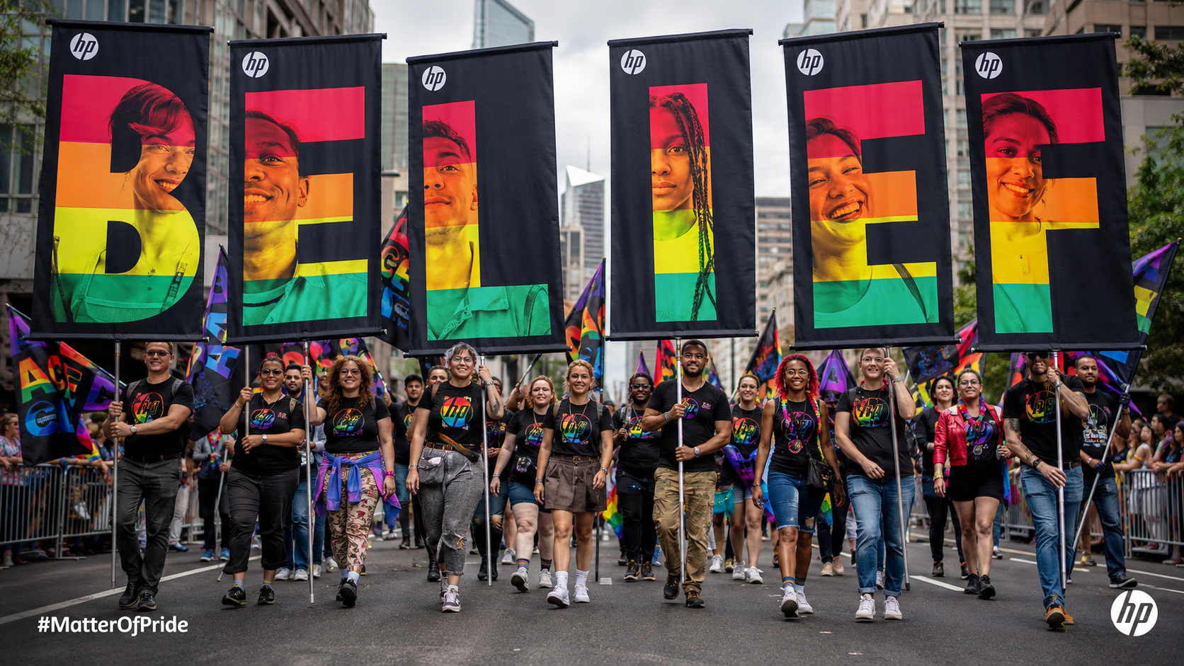
Designed to extend from social media into films, digital
billboards, workplace environments, parade installations and
participatory experiences, the visual system turns every
touchpoint into a platform for belonging. Because when inclusion
becomes visible, progress becomes impossible to overlook.